BATTLE READY; Digital Painting


Digital painting of a warrior in battle. In CS2, I like using gritty brushes to block everything in and then build up the areas of light with more refined brushes—this keeps me from painting too slick and smooth. Anyway, I suppose my detailing of the eyes are too sharp in terms of capturing a true rendering of nature but I wanted the attention focused in that area—so much emotional impact is expressed in the eyes.

As for the indication of gritting teeth, it's just two brush strokes but I re-painted those two strokes over and over to get just the right look. When you look at John Singer Sargent or Anders Zorn it's not just about rendering an image—it's about putting energy into each and every stroke. I think that's what makes painting fun and hard at the same time. The whole process is deciding what to leave in and what to leave out and making sure that everything that remains is there for a reason.

Add to Technorati Favorites

WARRIOR BEHIND SHIELDS; Digital

I painted a series of digital paintings to serve as inspirational bluesky development. The over all look and feel of the series was very intense so painting the images allowed me to explore some very interesting emotions. I wish I had more time to make the painting perfect but deadlines are deadlines. I could keep refining it but there are more paintings to do. Anyway, the emotional impact was really exciting to develop. The program I used was Photoshop CS2 with all sorts of custom brushes. I worked it just like an oil painting except I got the added bonus of using command z.


Add to Technorati Favorites

WARRIOR; Digital Painting


This digital painting was a blast to work on in CS2. Talk about primal therapy. I blocked everything in using a custom brush that was ugly grainy—I mean just plain ugly. I used this to work out the big shapes. Then I started to define forms—basically light and shadow using cross hatching. After that, I blended the hatching with my larger grainy brush. The background was ambigouis so the entire head would be the over all focal point.

The detail close-up shows how free the brush work was—just indications of detail in the right places. This painting is really a study of edges. The frontal face edges (although they vary) are sharper than the backside of the head and helmet. I've been studying Velázquez lately for edge work and shadow patterns. Simply amazing. Anyway, this painting gave me the opportunity to have a lot of fun playing around with the shapes and edges.

Add to Technorati Favorites

Digital Sketch—Game Environment II

Digital tonal concept sketch for a gaming company depicting a cityscape with forground elements. The emotional beat in this series remains consistant with the nature of the dark world depicted. This idea was painted with no preliminay drawings. My aim was just to capture the raw emotion I felt about the subject and the energy of the man on a mission.

Add to Technorati Favorites

Digital Sketch—Game Environment I

This is a rough digital sketch I painted of a city environment for a gaming company. I love doing this sort of design work using broad strokes and alternating forms to create movement and drama. All of the artists at the studio are top notch so I was a bit apprehensive at first, but the art took over and it was fun seeing this new world emerge as the strokes of digital paint came together.

Add to Technorati Favorites

Digital Sketch—Game Environment III

This gaming environment leads us inside a maze of steel beams and catwalks lined with tubular pipes, gas lines and cables. Painted in CS2, this quick sketch conveys the over all emotional dynamic of danger, hidden mysteries and pulsating directional lights. In this case, since it was just an idea sketch, I made it up as I went along feeling my way through the many possible design solutions. I had a lot of fun playing light against dark and exploring the raw emotion of the scene.

Add to Technorati Favorites

Marooned

My digital painting "Marooned" depicts a space trooper stranded on an alien planet illuminated by the moon behind him. Wreckage of his ship in the background along with distant planets hint to his long journey from home. His mission completed, so it seems, is now behind him as the lone survivor is forced to ponder his fate. The vast expanse of this desert planet is formidable, but nothing compares to facing the dark enemy he has hated for years—himself.

I was inspired by the great artist, Howard Pyle, who painted a pirate stranded on an island. The emotions of isolation and abandonment touched a cord in me and served well to set the tone for this space environment.


Add to Technorati Favorites

Naruto

I recently worked on product development designs for Naruto which is an ongoing Japanese manga series written and illustrated by Masashi Kishimoto. These are the only design sketches I'm allowed to show. It's funny how I finished illustrating a book project that was inspired by manga styling and then I get handed the opportunity to work on such a classic.

Nartuto is an amazingly successful brand and ongoing series. The artists on the project were just as amazing and fun to work with. Anyway, this is my basic film and product development sketching style for ideation and bluesky concepting. Michael Spooner was my artistic mentor in this technique and I still see his influence in my drawings and artistic vision.


The Doppleganger Chronicles


This is the first book in the ongoing series—The Doppleganger Chronicles by G.P. Taylor. I art directed the first book setting the style template with designers and artists from Markosia Enterprises in London and the USA based Tyndale House Publishers. I included the artist bio page to honor the London based artists Daniel Boultwood and Tony Lee—both amazingly talented and extremely humble guys. You can check out www.dopplegangerchronicles.com to see my video discussing the art direction.


Deadeye

I really enjoyed painting this character study of a cowboy who's eyes give a hint to the condition of his soul. Years of living in the old west has hardened him and his youth faded away along with his dreams. He's found someone he has been looking for making this is a dangerous moment—payback for something everyone else forgot about. He hasn't forgotten. It's as though it happened yesterday.

I wanted his face to be the primary focal point. The shadow color under his eyes is darkened and void of color to give a clearer vision of his nature and intent. This oil was painted on a double primed linen canvas using a lead primer. Very slick to paint on but easy to wipe off when a mistake is made. I allowed the canvas to show through in spots and had a blast playing around with the brush strokes.

Add to Technorati Favorites

Marvel

Copyright © 2009 Marvel Entertainment

More from Marvel. This was one of several sketches for a the animated television series. The character design incorporated a strong anatomical structure that had it's own look and feel. The hardest part, for me, was roughing the poses out trying several ways to express the action with the strongest sense of movement and form. It taught me a great deal about the line of action and posing the figure the Marvel way. I learned a lot from the artists working on this project. An amazing group.

Forever Friends

I painted this oil depicting a little girl who found a friend. The story in the painting depicts a lovely girl with the simple surroundings of a bare orphanage. The girl seems a bit out of place standing in the corner. There is comfort, however, in holding a doll that she found along the way. Their special relationship allows the little girl a friend wherever she goes.

The model for the girl was my daughter, Sarah, who my wife and I adopted from South Korea when she was a baby. I remember when Sarah got older she wanted a doll to play with. We went to the store and she finally chose the one she wanted. She smiled and gave it a big hug. At that moment, I saw in her the first hints of being a mother. A mentor. A woman.

It amazes me how many people define themselves by the job they fill or the talents they currently have. To me, being a dad is everything. When it's all said and done Sarah will remember me most—not for my art or design—but for being her dad. Her memories, as well as my son's, define me. Our relationship makes me the man I am. It also grows me into the man I want to be.

Add to Technorati Favorites

THE ADVOCATE


I painted this painting several years ago for my prison ministry at a maximum security correctional facility which the inmates have nicknamed—the wall. I have spent around twenty years or so making cell house rounds behind the wall using a special state issued security clearance. We started passing out posters and small prints to the prison population in the mid-west and then the posters gradually spread throughout the entire prison system to reach both coasts. 

The amazing thing is that this image even went to China through several missionaries who knew the painting would transcend human language and reach right into the heart. In addition to this, Alcoholics Anonymous used The Advocate along with my book for several of their prison courses which just blew me away. I even got a call from a friend of mine who secretly went into drug rehab and had to call me at the end of his class late at night just to tell me how much it touched him.


If you ever worked in Christian publishing markets you know it isn't any different then any other marketplace—people are people wherever you go. I thought this image was special and therefore didn't allow any commercial use of it to keep this experience free from the system. In spite of this, with no backing or system supporting it, this image reached across the country and around the world in a way in which no one profited but those who saw it. Wild.

Over the years I got busy paying bills working as an artist in the film industry and put this painting away for a while. Recently I started to release it on various blogs and on Facebook giving this image to another audience. The people who have it all together and are near perfect in their religious walk look at the painting and see a guy who really needs the Lord. Others who, at one time or another, hit a wall in life which left them broken and bruised but caused them to experience the love of the Lord actually look at the painting in another way—they see themselves. I do too.
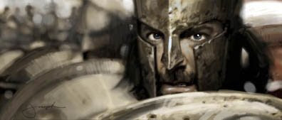
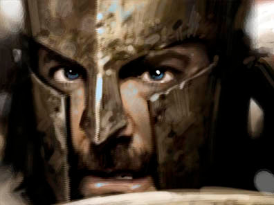

Nile Concept & Final Painting

The first image is a digital concept painting of a location I designed for an animated film. The second image is the finished digital painting I noodled out with various Photoshop brushes. Whoever programed "command z" is a friend to me.


Add to Technorati Favorites

Dr. Ken Taylor_02

It's exciting that one of my first corporate portraits was of a man I truly admire, Dr. Ken Taylor, founder of Tyndale House Publishers. This was painted from a black and white photo of him when he was in his fifties. One of the most humble and talented man you'd ever meet. The painting hangs in his son's office in their corporate headquarters.

Dr. Ken Taylor/ Oil On Canvas

Add to Technorati Favorites

Oil Paintings .02

More oils from my first gallery series. I chose painting kids because I love the innocence and honesty they naturally express in their eyes. My next series which includes much larger pieces focuses more on adults so I can explore deeper world weary emotions etched in their facial features.

This series, however, was challenging in the sense of painting a smooth child's face without getting too slick with the brush work. All in all I loved working with the models. When you think about it, oil painting is basically the art of capturing an emotional moment using animal hair attached to a stick to apply paint—no Photoshop "command z" to make mistakes go away.

Anyway, my son, Josh, posed for the painting Chores and the talented film director, Tim Hodge, posed for both Drifter and Hondo which was included here in an earlier post. My apologies to all of the victims—I mean models.

The Runaway

First Shave

Chores

Drifter

Jenny's Prayer

The Lil' Sheriff

The Westerner

Add to Technorati Favorites